
Measles update - sparks and smouldering
Measles update - sparks and smouldering

When you have reports of some infectious disease coming in, there are broadly two ways to order them: by registration date (when the report was received), and by occurrence date (when the diagnosis/test was actually taken).
Both registration date and occurrence date counts have the capacity to mislead, they just do it in different ways.
Let’s take registration date first. The flaws here are obvious. You get the wrong date for when all dynamics happened: the start of the outbreak, the peak, any inflection points. And, if there is some backlog of testing then suddenly you get dips in the data, followed by peaks when the backlog is cleared - and none of these have any relation to the progress of the epidemic. I complain about this stuff all the time.
So, obviously we should use occurrence date, right?
A plague on both your houses
Well, not always. Let’s look at the latest occurrence-date chart for the lab-confirmed measles cases as tracked by the UKHSA following the outbreak in Birmingham:
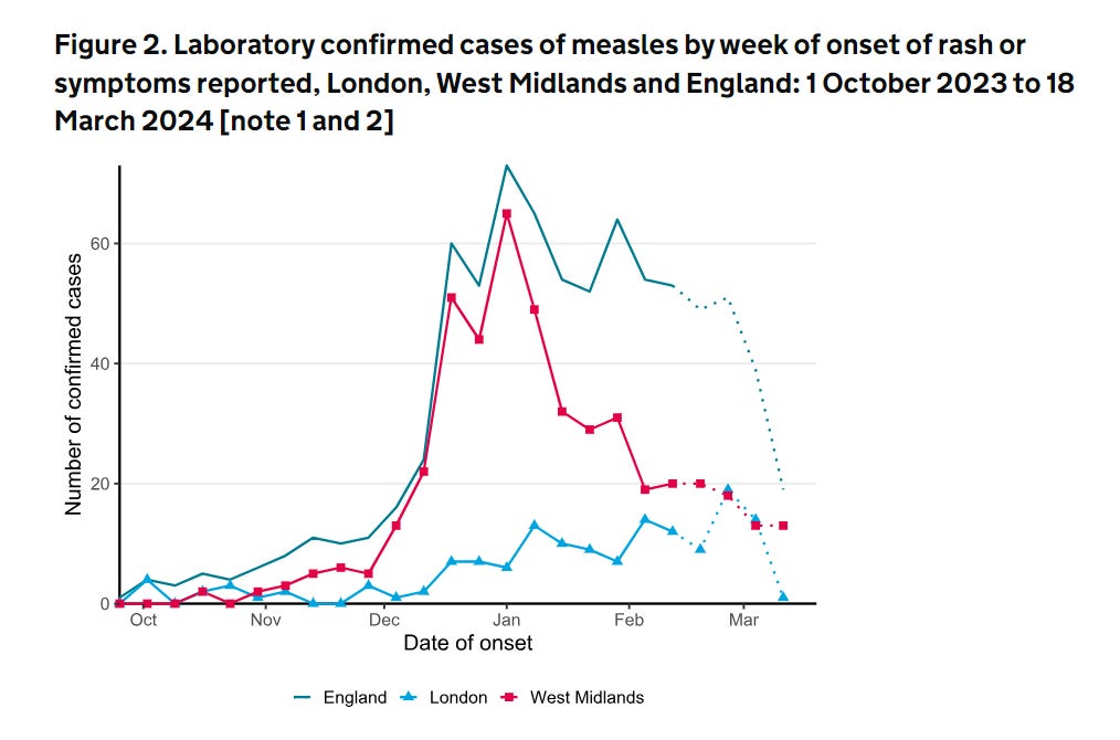
Now, this looks like very good news. The overall numbers are coming down, especially in Birmingham (West Midlands), and despite the early growth in London (where vaccination rates are particularly low), this now seems to have collapsed.
Unfortunately, while two out of the three points here are probably true, the last one probably isn’t. The abrupt fall in the light-blue London line is almost certainly an artefact of tracking live outbreaks by occurrence date.
The whole point about occurrence and registration date data is that reports and tests take a while to come in. The last few week occurrence counts are almost certainly incomplete (that’s why the report has “dotted” them out). And this distinctive pattern we see in London, of a slowly growing trend suddenly falling off in the last data point or two is an immediately recognisable feature of “occurrence date” data which may not in fact be falling at all.
Now, there are various ways of getting around this by using clever maths (my own geeky favourite is to train a predictive model on the delays you’ve seen in the past). But all these methods have a common drawback - since they are trained on past data, they tend to not be able to cope when the dynamics change abruptly. That is, they become least reliable when cases abruptly change their trajectory, and when labs get overwhelmed. Which is precisely when you need them most.
Instead, there is the unfashionable option to use human brain-power, and supplement the occurrence date data with some reporting date data, and look at them both together.
Now, in this case the reporting date data is not explicitly available. But you can get it with some use of the internet’s most underrated resource, the Wayback Machine/Internet Archive, and comparing the UKHSA’s measles case tables week-by-week as they update them.
A variety of different plagues on several of your houses
I’m not going to give the numbers raw, because there was a confusing problem in early March 2024, when a lab suddenly realised that many of the positive results it had previously certified were in fact mistakes.1
We are going to smooth over these weeks and give the net rates per day. Looks like this:

This - I think - gives a good picture of the current situation, at least at the reporting level. As suggested by the occurrence date read, the large West Midlands outbreak is coming down in report rates.
This outbreak seems to have "sparked” a few flurries of cases outside the West Midlands in January and February causing a few cases to be reported in every English region. But all of these have settled somewhat now, with one exception - London.
In London, which holds some of the least vaccinated areas in the UK, these “sparks” have not yet died down, and we are still running at about 2.4 cases being reported per day (and remember, these are lab confirmed cases).
Now, this kind of rate is not unprecendented for London in recent times - drawing again from the outbreak report, you only have to look back to 2018 and 2019 to see similar (monthly peak) rates in London (2.4 per day for a month is about 80) - so we have a good amount of historical precedent for an outbreak to “smoulder” in London without exploding.
But it’s not falling yet either.
As few plagues as possible on everyone’s houses please
So, by combining these two pictures - occurrence date and reporting date, I think we get the best picture of the current measles outbreak we can frame - at least with publicly accessible data.
The Birmingham outbreak is now declining, fairly convincingly, from its peak at the end of December 2023. This is very good news.
This outbreak seeded cases elsewhere in the country - there was a flurry of confirmed cases in more or less every region in Britain in January and February 2024.
These have all now more or less petered out in every region, with one exception: London, which is unique in seeing enough transmission to keep the cases ticking over, at a growing-but-still-low rate. The reason for this are not difficult to find.
Overall, we could look on this situation as good news - certainly better than many of the alternative outcomes from the Birmingham outbreak.
This London “smoulder” is not ideal, but fortunately, as of the data we have today, this does not yet seem to have converted into an explosion of cases - which is what would happen if the transmission chain “found” a large pocket of unvaccinated population to transmit through without early detection and isolation.
As everyone involved in public health in London is no doubt uncomfortably aware, these pockets exist.
This appeared to be the largest contributor to some fairly involved confusion as to what on earth was going on - including reversing a massive jump of 80 cases that had been newly detected in late Feb/early March. It messed me around for days.
Do we have sequencing or contact tracing data to link the London outbreak(s) with the West Midlands outbreak? (There is a possibility that London outbreak(s) got seeded independently by travel to counties with their own significant outbreaks.)