
In December 2022, the mean response time for a Category 2 call in England - the one you’re put in for a suspected heart attack or stroke - hit the frankly unbelievable national average of 1 hour and 32 minutes.
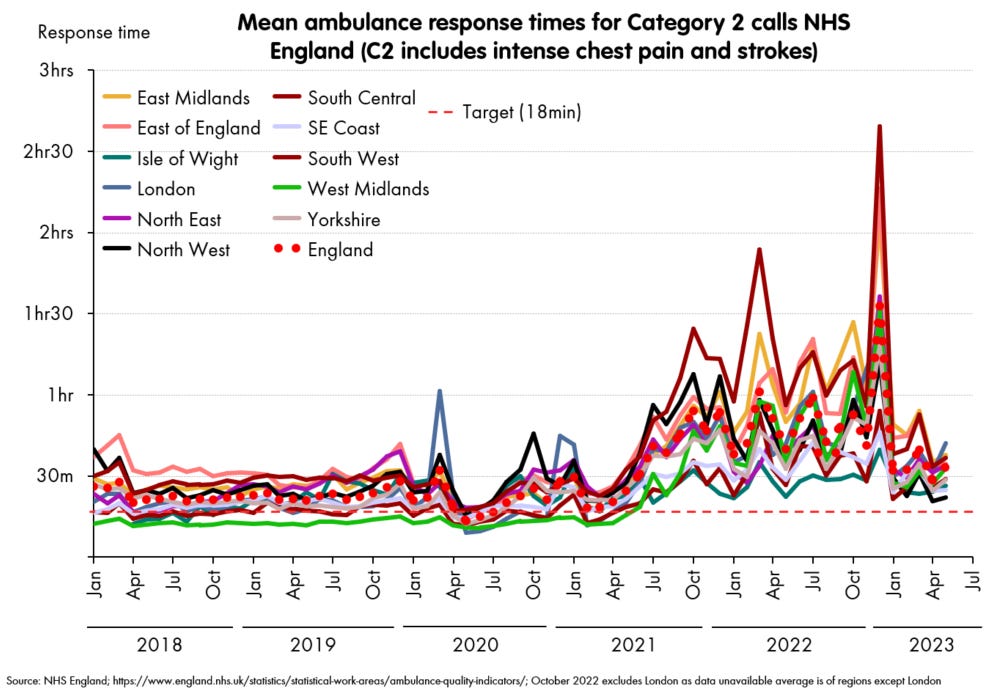
These mean averages aren’t the worst times anyone experiences. A notorious 40 hour wait for a Category 3 call happened in August 2022, when the national mean was lower, and it was by no means an outlier. But the mean gives you the “expected” time to wait, while allowing that there would be many worse off than you - it’s the measure I’ll use from here on.
How did this get so bad? As many people have noted, the main bottleneck has only a little to do with these ambulance services, and almost everything to do with the hospitals they’re going to. Here are the mean patient handover times for each of these ambulance services at their destination hospitals (this data is daily but I’ve smoothed it over 30 days, and note it’s only since 2020, so the below relates to the right hand 2/3 of the previous chart).

The correlations are obvious, and given these are the times the ambulances are waiting with patients in the back, it also tells you where the problem is. If numbers of ambulances or crews were the limiting factor, these handovers would not at all track with the response times: each would hand over to the hospitals as fast as possible, and race out again to get the next patient. The fact that they do track so precisely tells us that the bottleneck(s) must be downstream from the ambulance handover point.
Oversimplifying only a little, the ambulances aren’t able to respond to calls in time, because they are all parked outside hospitals waiting to hand over the previous patient.
Blindly adding more ambulance resources will do very little - there’ll just be a larger queue of them parked outside each hospital. Ambulance response times are - effectively - becoming very little to do with ambulances, but have become the clearest indicator we have of the seize-ups in their respective hospitals.
In fact, these correlations are so tight, it’s worth actually drawing them (caveats: yes, these are time series, so for goodness’ sake don’t trust r-squared and similar metrics). This log-log plot shown here is compelling, and the log-log relationship has some backing from queueing theory as to why it should hold.

A similar tight fits exist for all the ambulance services (except for the Isle of Wight, which for obvious reasons has different dynamics, and suggests hospital capacity is not the limiting factor there).
And this also suggests we might be able to infer something else. Let’s look back at the ambulance service that really does stand out from the others: the South West, and look carefully at those handover times, this time plotting each day without any smoothing.

It’s very clear that the monthly averages are concealing a lot of variation. And that saying “December 2022 was the worst” really means that there were a few utterly diabolical days in December 2022. To be precise, these were the 19th and the 29th of December, with the couple of days either side of each.
Can we work out how bad it got on those days?
To do this, we must make a couple of assumptions, which are each plausible, but not necessarily correct.
First, that the relationships between means of handovers and responses that holds at a monthly level also holds when the means are taken at daily level (this appears reasonable).
Second, that this relationship holds beyond the range we’ve seen it within so far (this is also reasonable but could be challenged).

If you make those two assumptions, then you can look at what the daily data for handover times implies about particular days in terms of average waits. You simply fit them using the line on the chart - and the 29th gives 3 hours 45 for the category 2 mean.
In fact, we can go one step further. Data for handover times is also available for individual hospital trusts. I won’t go around naming and shaming, but just to grab the relevant data point, the worst of all was Plymouth on this same 29th of December. On that day, they recorded mean handover time of over nine hours (on a sizable sample: 58 handovers, yes I know it’s mad). I simply refuse to believe that the extrapolation to Category 2 response times is valid here: naively it would come out as 18 hours, so I can only assume that this indicates gridlock, the assumptions break down and in reality they would be desperately drafting in crews from other parts of the South West region, and once the patients had been reached, they would be diverting them to other hospitals.
But though I don’t trust the precise figure, I do think we’ve found the time and place that everything got as bad as it ever has, so let’s call it here:
The very worst time and place in the last several decades to experience heart attack or stroke symptoms (or to experience any other medical emergency) was on the 29th of December 2022, in and around the city of Plymouth.
If you had collapsed with symptoms of a stroke or heart attack in Plymouth on that day, and called for an ambulance, you would expect to wait at least five hours, and quite possibly far, far worse.
The target time for the Category 2 emergency calls - as set in the NHS constitution, and as believed to be within the bounds of patient safety - is 18 minutes.
It feels almost unfair to look beyond that: at emergency, but non life-threatening calls, but it’s perhaps worth spelling it out. If an older person had fallen and broken a bone, they would have been put in Category 3. An ambulance would not have arrived that day. For more than 10% of them it would not have arrived the next day either. England (and in particular, the South West) underwent a total collapse of emergency medical services in December 2022, and we are not yet seeing plans for winter 2023/24 that will preclude a repeat.