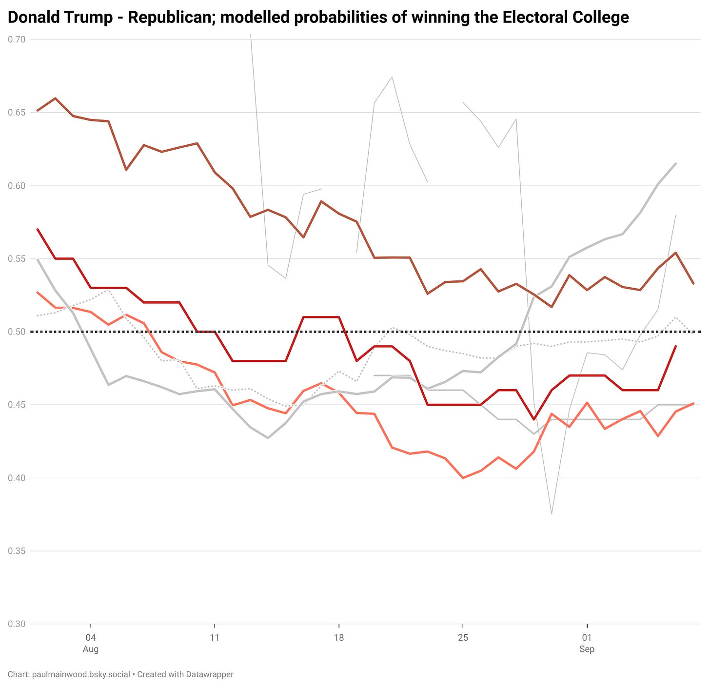
Incestuous US election modelling
The House of Hapsburg-Linzer
Take the probabilities assigned to a Donald Trump victory by the most prominent election modellers, and file off the names.
They all look different. But note that there’s three that tend to move together, and do so a great deal more than with the others. I’ve highlighted them in red/orange here.
(Note that this is just a static snapshot, and will not be updated, unlike the main page which keeps track of the latest numbers every day, tracks Harris’ chances, and provides each model’s state-level probabilities for each candidate.)
These three may not quite all move at exactly the same time, but it’s always within a day either side, and the overall “shape” is very distinctive - this shape is not shared by any of the others, nor with the dynamics of the betting markets (the dotted grey).
So, let’s take a cheat-peek at the names. These three birds that flock together are:
The Economist’s model
The FiveThirtyEight model
The Data Diary model
And now they are identified, we can look back at their history and hypothesise a reason that they are moving together - despite their differences in “level”.
They are - essentially - the same model.

