Sometimes, just occasionally, I become overwhelmed with the thought that the couple of pieces of silicon sitting in the plastic box in front of me contain more computing power than the entire world did in the 1970s. And then, I feel the need to use it.1
Bayesian Structural Time Series are a computationally expensive way to do something conceptually simple.
Say you’ve got some set of measures wiggling around over time: COVID infections, for example; and some other measure wiggling around: COVID deaths, for example; you might want to find the relationship between them.
I’m being a bit coy here. The “COVID infections by age” in England and Wales are from the ONS’ COVID infection survey: a tiny little wonder of the world, which took a random, representative sample of the UK population and tested them regularly over time. So - pretty much uniquely in the pandemic, and across the world - it gives us an estimate of true population infection levels - not some count of cases in the skewed contexts we happened to test for them.
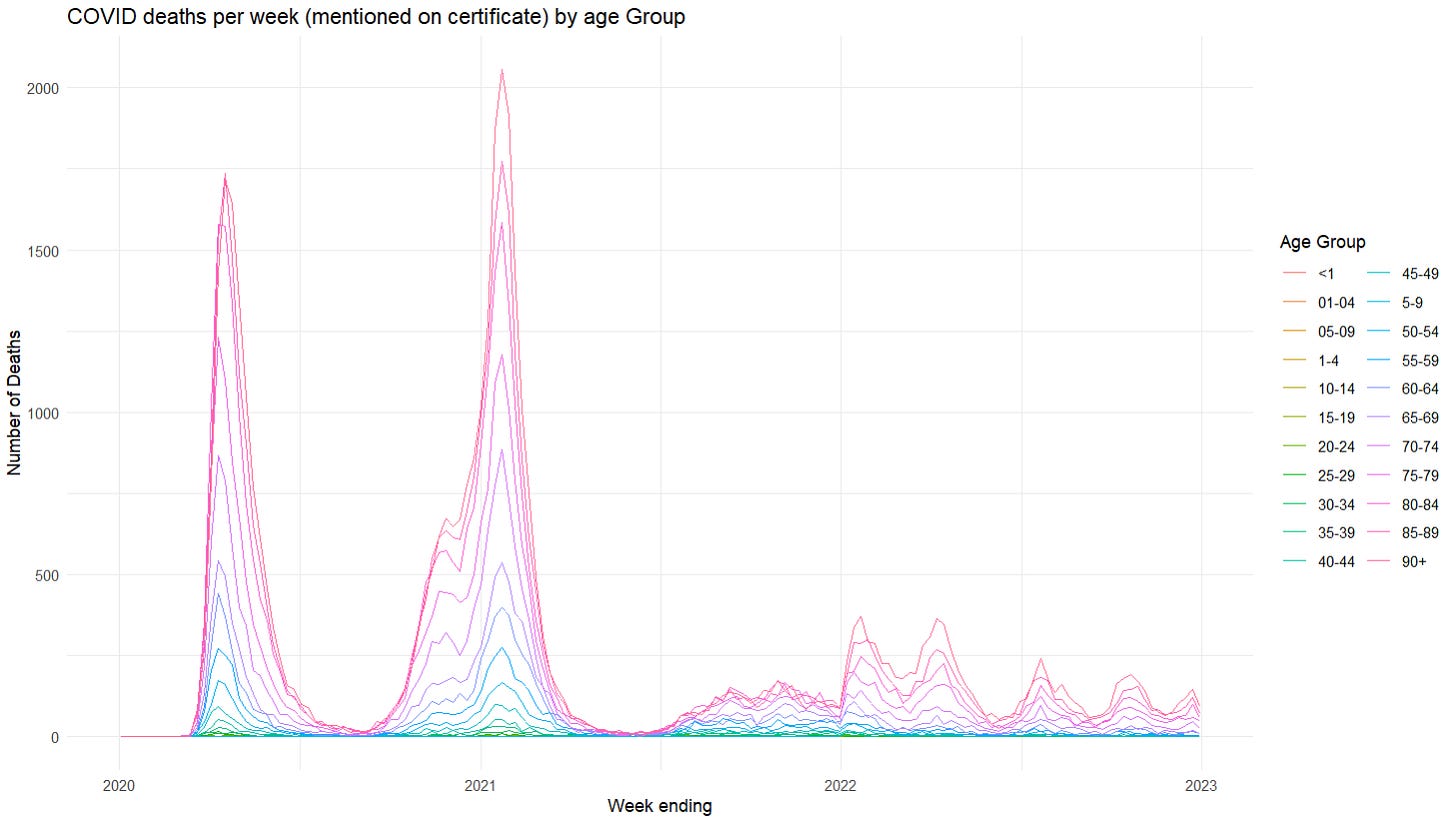
Likewise, COVID deaths are via the ONS analysis of mention on death certificates - we’ve got a nation of doctors doing their best to spot COVID and tally up those cases where they judged it causally contributed to a death. And these two datasets are on the same baseline population (England and Wales). Given this is pretty-much uniquely high quality data, it’d be really nice to be use - and in particular - to find the relationship between these two.
If the relationship between the two were fixed and constant, there would be no problem. You’d just use some kind of regression approach to see how these two things were changing together - you might have to transform some variables, and there’s obviously a lag to deal with, as well as some fiddly matching up age-groups and days/weeks … but it’s all possible.
The issue is, the relationship obviously is changing over time. Look at the deaths vs the infections in mid 2020 and early 2021, compared to the deaths vs infections near the end. And given the variants, the treatments and the vaccines coming in at different times, it may actually be the nature of this change over time we are most interested in.
This gives us more than enough excuse to wheel out our Bayesian Structural Time Series (which fall under the broad headings of state space models or dynamic linear models).
Our beautifully crafted sledgehammer
What these wonderful pieces of mathematics do (roughly) is to look at the two time series, assume there is some relationship between them that we can specify, and then find the simplest and smoothest “random walk” that the parameters in that model can perform that could reproduce the patterns we see.
The power of these techniques really lies in the fact that you can set up the relationship between the observed quantities to be more or less anything you like all piled on top of one another: seasonal factors, ones dependent on thousands of other external factors, periodic terms, having a linear or exponential trend in the background, involving trigonometric functions … pretty much anything you like.
But now we’re going to use this analytical sledgehammer to crack a peanut. We’ll settle down and assume that the relationship is a simple multiplication - that is, deaths = infections [with some lag] x some number - encoding all any any time-varying dynamics into the variation of that “some number” that you have to multiply the infections by to get deaths.
That is, we are choosing the “some number” to be spat out by our overpowered model in such a way that it gives a direct estimate of the IFR: the “Infection Fatality Rate” - the answer to the question: Of all the people who get COVID, how many does it kill? Or, more precisely, how many subsequently die with the attending doctor marking it as a contributing cause on their death certificate?
Before we go any further, the usual caveat. We are not doing this very well. It’s not peer reviewed. It might be wrong. It’s good data, but proper epidemiologists apply big fancy models with distributions and stuff. And I’m the sort of person who - when presented with some intricate statistical distribution with exciting and intriguing properties, tends to sigh and take its mean.
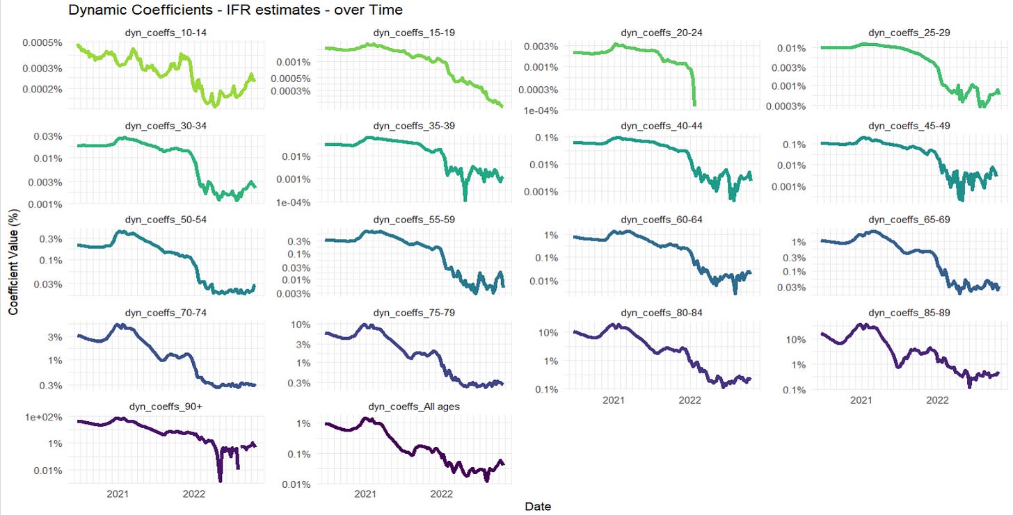
So, after a lot of fiddly age-group matching, optimisation of infection-death lag (this comes out pretty high - around 32 days for many age groups from infection to death), we can chart the following for each age group.
There’s a lot going on here, and we should always be conscious that some may be an artefact of the Bayesian fitting, especially some mismatched lags. But in terms of interpretation, there’s a few features worth pulling out.
First, we’re completely missing the first COVID peak, which was in April 2020. There’s no getting around this, the COVID survey simply didn’t start until later on. We can see the IFR sloping down from there though, so there’s an obvious qualitative inference back to a high IFR during that time, especially in the oldest.
Second, there’s a peak of the IFR around the second COVID peak of Dec 2020-Jan 2021. Note that this is in addition to the infection rates peaking at this time, and the deaths peaking nearly a month later. Even a flat IFR would have given a sharp peak in the deaths over that period, but the model is implying that the death rates per infection shot up at this time too. After experimenting with lags, I am reasonably confident that this is reflecting something real, and while some of it may be coming from a lag artefact,2 I don’t think it all is. And it’s hard to ignore the fact that hospitals were overwhelmed at that time.
Third, there’s the obvious plummet of the estimated IFR, which starts in the oldest ages just around Jan-Feb 2021, and is followed, somewhat later, and less steeply, by the other ages - going down and staying down way below where it was even in the low infection summer months of 2020 (I’ll make no claim on mechanism, but it’s pretty obvious). The panels for the 65-80 year olds demonstrate this on an especially usefully visible scale'; the new estimated IFR can be seen down at ~1/5th of the previous rates - even as variant after variant started to march across the newly opened-up country.3
Finally, there’s a further switch in December 2021 to January 2022, when two things happened at once: boosters were introduced on top of the original two-injection courses, and Omicron swept in and took over orders of magnitude faster than any other variant had done before. Whatever the interplay between these two, the estimated IFRs plummeted again, in many cases down by another factor of 10. (the linear scales don’t show this very well, so it’s worth adding a log-scale version to see it more clearly).
But overall, the two largest factors that fall out are familiar ones.
COVID was very good at killing old people. But throughout the pandemic it mercifully bad at killing the young - bad to the extent that after vaccines became available, there were so few deaths amongst 20-24 year olds, it breaks my model.
COVID is nowhere near the mortality threat it was. For most (vaccinated) today, it’s about 20x less dangerous than it was in 2020-21. We’re talking about something that can nowadays barely muster a ~1% IFR for the 90+ age-group.
We knew both of these things already, of course. But it is so very nice to have them fall out so clearly from the best data in the business, and - even better - with the aid of far more computing power than is necessary.4
Not on mining crypto, obviously. I’m not a monster.
That is, when you have a peak of infections and peak of deaths offset by time, then unless your model has the delay correct, it leads to a “bump” in the IFR as the top of the deaths peak hits the downward slope of the infections peak - or vice versa.
If you adopt the hypothesis that this is due to, then it’s important to notice that it will dramatically understate their protective effect. For the vaccines - at least vs the variants circulating at this point - were also protective vs infection. So this will not be reflected in a drop in IFR - the avoided infection will not appear on the top or the bottom of “deaths/infections”. What you get instead is a measure of how much better the vaccine is at protecting vs death than it is vs infections.


