

With COVID or for COVID?
And are these hospitalisations really going down?

Favourites amongst internet reply-guys come and go. “It’s seasonal” (except when it isn’t), “It’s the flu” (it really isn’t), “It’s not over” (apparently it’s binary), “There’s no testing any more” (to data from the ONS randomised survey).
The title of this post “With COVID or for COVID” was a long-time reply-guy favourite to all COVID hospitalisation numbers since April 2020: are COVID patients in hospital because of (for COVID) or do they just happen to have it, while actually being there for something else (with COVID)? Bet you never thought of that eh?
Claims around these ranged from the reasonably sensible (“it would be helpful to know”) to the unhinged (“there’s no-one really suffering from COVID at all”).
In a perhaps over-helpful attempt to find out, the NHS started to count their COVID patients by primary diagnosis (i.e., what they’re primarily being treated for vs what are secondary or tertiary diagnoses). As they admit, it’s often unclear and a clinical (or, less helpfully, an administrative) judgment as to which of the various things making people sick is “primary”, so this is done by each trust to best efforts. But the patterns are pretty clear.

Four observations on this data, ordered by increasing relevance to the present day:
The reply guys were tediously wrong. They went on about this for years, and yet when people actually collected the data, it turns out that - even in mid 2021, and post-vaccine - ~80%+ of COVID patients in hospital were there primarily because of their COVID: at least as far as their doctors can tell. Until Omicron.
When Omicron came along, if shifted the background. pre-Omicron prevalences in the general population were <1%, compared to Omicrons ~2.5%. So, dramatically but quite unsurprisingly, when you have a certain number of patients who just happen to have COVID, then when background prevalence rockets, that number also goes up by 2-3x. This turns out to be a dominant effect, so those with non-primary diagnoses go up from ~20% to ~60+%, so the “primary” lines sink down to ~40%
The regional differences are striking, but are most likely driven by a) regional differences in practice (e.g., when to count something as primary) as well as b) levels of specialism. London has a lot of specialist hospitals, where people are in for all sorts of complaints, and may have more incidental. The South West has relatively few.
Surprisingly, there’s been very little shift as hospitals wound down mandatory testing in 2023. This is interesting - and somewhat surprising. Many people have suggested that the reason that overall COVID hospitalisation numbers have come down recently is because that there is less routine testing in hospitals. But if this were a major effect, you would expect to see it come through in this primary diagnosis ratio - specifically you’d expect it to go up. As mandatory testing falls, hospitals should become much worse at discovering mild cases, in those who are admitted for unrelated complaints, while becoming slightly worse at diagnosing people who are brought in for serious cases of COVID that are the main thing making them sick. So you’d expect the lines to go back up again as the majority of people they find with COVID are those who obviously have it, while secondary diagnoses are missed.
But they haven’t moved up at all. If anything, they’re going the opposite way.
So, when we look at a chart like this - showing the hospital admissions (note log scale please) - can we trust that fall at the end, or not?

We’ve been here before
This reminds me strongly of the situation in Nov-Dec 2021, where a lot of very media-present people looked at the rationing of COVID tests, and a rise in COVID cases. They judged the rise in cases less than they “should” be, and jumped to a conclusion. They claimed that the true numbers of cases were in fact rising enormously compared to the number of COVID tests, and we just couldn’t see this because people with COVID couldn’t get the tests.
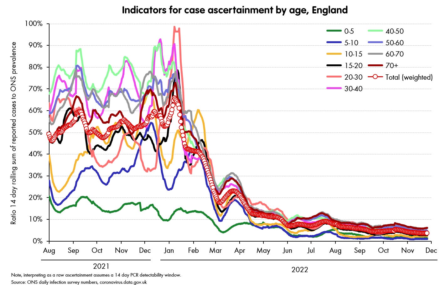
In fact - though the claim was made even by academic experts on testing - it was data-free speculation. And it was wrong. When you actually looked at the data - in this case the case ascertainment ratios for the second half of 2021 (how positive-reported-test-rate compared to the rate-of-infection, as revealed by the randomised ONS study), it was pretty much as high as it has ever been, at 50% or even 60% at times. It was only in the New Year, and even then only really March 2022 onwards, that ascertainment plummeted.
As so often, it appears we had a so-called “narrative fallacy” which overtook everything else. The narrative fallacy is to judge the strength of an effect by the strength with which I believe the story that accompanies it. That is, I have heard of people not able to get tests while feeling ill, so I can strongly imagine their suffering without being counted in the numbers, therefore the effect must be strong.
In fact, subsequent waves of Omicron later on in 2022 were then hit by a low-testing effect (the ONS survey was still running and revealed the true numbers, with the second wave actually being larger than the first). But by then everyone had settled down and the testing claims were old hat.
So what do we think is going on in hospitals now?
Back to the present day - June 2023 - can we trust this kind of chart as showing a real effect?

A major problem is that we really do have much less to go on now. The ONS survey has stopped, there’s next to no community testing (see chart above: <1 in 20 infection are being picked up), and the hospitalisation data is standing as one of the few decent sources left. So if it’s now faltering, it would be very difficult to pick up: there’s simply nothing else to calibrate it with.1
My own judgment FWIW, is that this fall is likely real and not a testing effect.
The first reason is the stubborn lack of a jump up in the “with/for” relationship, as explained under point 4 above, which I’d point to as a pretty diagnostic test - at the very least you need an explanation as to why it’s actually moving the other way.
Second, changes in testing policy don’t drive exponential decay (= straight lines on log graphs), but waves of an infectious disease such as COVID do - both on the way up and the way down.
Third, overall pressure has come way down on hospitals since the end of last year - we can see that in overall bed utilisation, and it’s more than usual seasonality; there’s no way to make overall utilisation a testing effect.
Fourth, in those places where hospitals are still testing for diagnosis, the numbers are also coming down, and doing so just as fast. For example, the numbers of COVID patients in mechanically ventilated beds (ICU really need to know what’s stopping a patient getting oxygen into them) are falling at about the same rate as overall.
Finally - less statistically solid, but often a surprisingly reliable approach - you can just talk to people. If you ask them, clinicians will tell you what their hospital looks like, compared to previous peaks.
None of these are definitive, and there are certainly other factors to consider, but I think together they add up to a clear picture. The question of whether the apparent fall in COVID admissions is just a testing effect is serious, and one that should be considered - it’s a genuinely good question.
But I think that it’s one with a genuinely clear answer: ‘almost certainly not’.
ZOE is continuing, and also showing a fall, but I am afraid I think the only rational response is to ignore it. When you could check it against better data sources it was demonstrably overconfident, overpromoted nonsense. Now that those better data sources have gone, this is just a bit less demonstrable.