Solid numbers
Number twos, mostly

Wastewater surveillance has been a hot topic in many countries for a while now. It’s been used for spotting the appearance of pathogens where they should not be (e.g., a single London polio case was detected in wastewater1), for new strains of existing viruses (coronavirus strains across the US) and - especially where better data is not available - to follow trends in infection.
A problem with the last of these is that levels of virus in wastewater can be massively swayed by just a few freak events. One striking example was highlighted by Professor Marc Johnson from data in Ohio, where a single person was able to shed so much viral material within a town of 15,000 people, they collectively gave the highest ever reading in the pandemic - despite infections being low in the remaining 14,999.2
In the UK, we have not focused on wastewater for COVID tracking quite as much as others, largely because of initiatives like the ONS survey, which give a more accurate assessment of prevalence (and also allow sequencing, age and other demographic profiling, with full traceability back to the subject).
But of course, we don’t have that any more, so it’s a good idea to revisit wastewater again.
The history of running both alongside one another - at least in Scotland,3 which publishes its wastewater levels daily - means we have valuable a dual read. And this allows us to check how well wastewater tracks vs a background standard for infection.
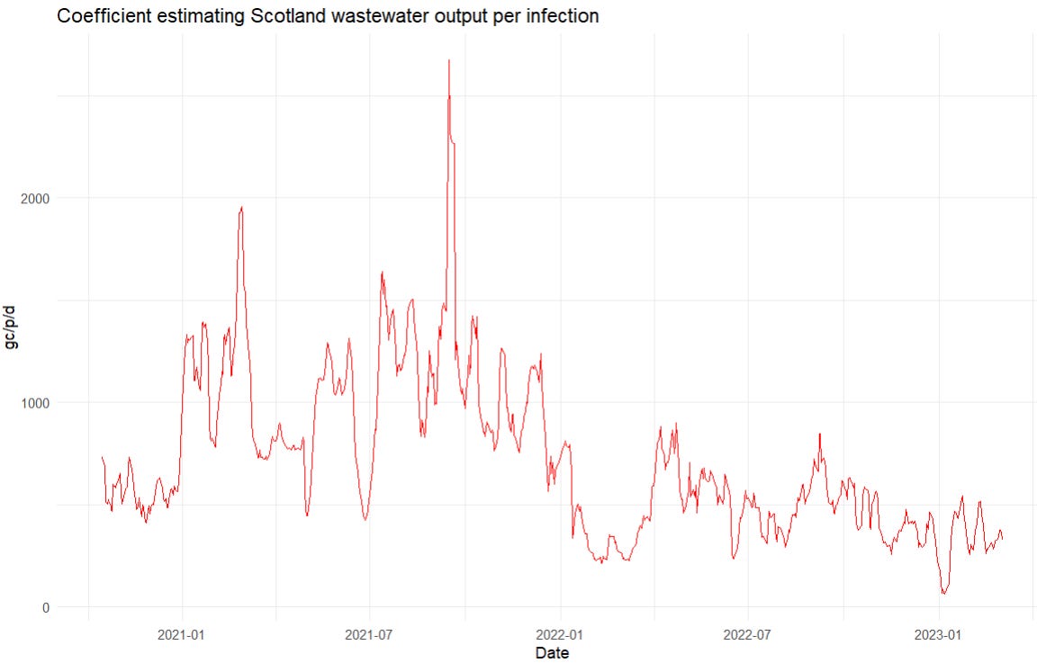
After consolidating, interpolating, rolling averages, and all sorts of other shenanigans (which I hope didn’t screw anything up4), we get this for Scotland:

A few things of note:
The correlation is imperfect, but it’s also directionally clear (i.e., a consistent trend up in one is almost always is associated with a trend up in the other - we can check this by looking at the correlation in the gradients of the two lines, which do indeed match better than the absolutes).
On timing, wastewater prevalence mostly leads PCR prevalence by ~7-10 days. However, this varies, and there are some exceptions - most notably the second Omicron peak (March 2022, BA.2) , where the ordering seems to have reversed.
There are some crazy spikes in the wastewater level which do not reflect infections (e.g., September 2021), which may be down to an Ohio-like anomaly, or a testing issue. These also appear at a lower levels, so it may be worth smoothing data even further (it’s already a 7 day average, and averaged over all of Scotland).
There is a clear time-varying effect - overall, the amount of viral RNA per person infected is lower by a factor of ~2-3 than when we started. And the relationship looks messy. In particular, there’s looks to be a huge discontinuity where Omicron came in.
Now, no-one wants a time-varying regression using Bayesian Structured Time Series do they? (Waits, pantomime, for audience response) … ah everyone wants a time-varying regression using Bayesian Structured Time series.
Well here we go (I’ve just used a constant lag value, since what you gain in stability in one time-period, you lose on others.)
While it is almost certainly possible to improve on this with a little work, this plot gives the idea - it shows a relationship between infection levels in Scotland (number of people testing positive on PCR, and the amount of wastewater traces of COVID we’re getting). Roughly, it reflects the “amount of waste material per live infection”, and it’s … a bit of a mess. As we saw by eye, Omicron infections seem to give rise to less waste shedding than previous strains, and the pattern might be trending to less and less as time goes on. But overall, it’s all over the place.
So, wastewater is looking like a decent tracker of the trend in infection levels, albeit one that:
Has a bunch of spurious spikes in it that do not appear to be connected to real infections
Varies by time, and by variant - so that deriving a reliable level from it (as opposed to a trend - up or down) is looking pretty difficult
To illustrate this last point, we can apply this correlation to a puzzle we’ve had for a while - are we missing hospitalisations in the UK? That is, hospitalisation levels for COVID have been falling for a while now across the UK, but so have testing regimes. How much - if any - of the fall is down to reduction in testing?
Wastewater might be thought to give a view into this. Since it tracks - imperfectly - but tracks in some way: levels of infection, then we can compare it to hospitalisations and see whether they’re about the levels we’d expect, or whether there’s stuff missing.
We have hospitalisation levels alongside wastewater pretty much up to present day. Plotted together, they look like this:

Once again, we can see a time-varying relationship, with wastewater leading hospitalisation levels by a few days (around the same time as admissions). But, more fundamentally, those who think that we are missing hospitalisations should be sitting forward right now. The levels of COVID remnants in Scotland’s wastewater are much higher, historically speaking, that you’d expect with the hospitalisation levels so low. You can see this with the red line up above the orange one - a few months below it was well below it.
And we can add to this, there’s good reason to believe that this understates the issue. we saw that the wastewater sample per infected person was drifting downward. Now we see that wastewater levels are pretty high. So - making the obvious inference - actual infections must be MUCH higher than they were, and in turn, it’s reasonable to infer that hospitalisations must be greatly underestimated versus their true level.
Here’s the problem - let’s go back that chart of wastewater output per infection and put in what it would have to be for there for our hospitalisation numbers to be faithful over time.5
You can simply do this by eye. In January 2021, the infection level peaked at 210k, and hospitalisations at 1250, giving an IHR of ~0.6%. So current hospitalisation levels of 400 / week, give 67,000 current infections or thereabouts. Wastewater levels are at ~500 Mgc/p/d (ignoring the spurious peaks, which we see every time). So for the hospitalisations to be placed where we’d expect them - vs where they’d be if the levels/infection had remained constant, you’d have to believe that our chart of the output per infection has done this:

The thing is, I totally believe … both of them. Or, rather, I find either pattern, given what we know, totally within the realm of plausibility. So we see that wastewater levels do not constrain what we should believe about the level of current infections very much at all.
In my mind, this is a useful illustration of the way wastewater data can and cannot be used.
It is invaluable for many monitoring applications - particularly for binary questions: “is pathogen x or variant y present or not?” But it is much weaker on levels and dynamics. When it rises consistently (i.e., not just a single anomalous spike), we can be fairly confident that infections in the community served are increasing as well. But the “drift” vs a consistent measure of true infection numbers means that - even after just a few months - it quickly becomes fairly useless as a measure of the true level of infections.
So, my suggestion would be to use wastewater levels, but carefully. Don’t get caught up on sudden spikes (they spike suddenly the whole time), and don’t use them to compare year-to-year levels (they drift about a lot). But for trends and long-term patterns, as well as their core use on variant and pathogen detection, they look a hugely valuable data source.
Which led immediately to a precautionary vaccination drive across the capital: you don’t screw about with polio.
This magic was possible because this was a single cryptic lineage that was never found anywhere else before or since, and occasionally travelled about to neighbouring sewage areas. It was clearly a single individual - but the volume of fragments shed was enormous.
England and Wales track it too, but the full datasets are much more difficult to source.
I hope not, but if you want to check, the source code (in R) is all here on Github and should allow you to replicate all the analysis from the source files (note the commented instructions for the Scotland downloads - they require a new link to be generated each time from their Shiny app).
We’re here ignoring the fact that IHR - the infection hospitalisation rate - is almost certainly also varying over this time. This just adds more degrees of freedom, and makes iteven more plausible that things could be shifting.
Like you I have been tracking the Scottish wastewater monitoring and always wondered why the lag between ‘wastewater’ to case peaks ‘reversed’ when Omicron arrived. You may already have seen it but there was a great paper in the Journal of Water & Health that reviewed Scottish wastewater monitoring and how it informed policy making. It’s worth a read.
They answer my question on how they adjusted for dilution due to sporadic rainfall -- it’s all to do with flow rates and ammonia levels (I think they were too polite to mention what the last one really measured).
Anyway the paper describes how they deal with the outliers you mentioned and talks about the Omicron effect. They note that detection became more difficult with Omicron due to a reduction in the ‘Covid shedding rate’ and changes to case ascertainment due to changes in testing policies. Although I suspect that the story is more complicated than that.
https://iwaponline.com/jwh/article/20/12/1688/92556/Wastewater-monitoring-of-COVID-19-a-perspective
This may be a stupid question, but I’m wondering why we can assume the “spurious peaks” you describe are only that.